Open publication - Free publishing
Wednesday, 29 February 2012
Book works
Today me and Francesca went to Leeds museum discovery centre to look at some butterflies. There some amazing examples and this trip has given us me some great ideas for some illustrations, here are some photos that we took.
Wednesday, 22 February 2012
Choosing a brief...
Todays session focused on choosing a brief that we both wanted to work on. We had to analyse and break down each of the briefs we had initially chosen.
First of all we had to narrow it down to three between the two of us (one that we hate and two that we like).
We both hate the SEGA brief and like the look of the Swarovski and Fedrigoni briefs.
We listed 5 reasons why we dismissed the SEGA brief and 5 reasons why we chose each of the other two.


We then looked at the brief in more depth and listed the things the brief was asking us to do and problems need to be solved.


First of all we had to narrow it down to three between the two of us (one that we hate and two that we like).
We both hate the SEGA brief and like the look of the Swarovski and Fedrigoni briefs.
We listed 5 reasons why we dismissed the SEGA brief and 5 reasons why we chose each of the other two.
Me and Baljeet discussed the pros and cons of the two briefs we liked and came to a decision to work on the Swarovski one. Here are the reasons why...

At the end of the session we broke down the brief and listed 5 key words for the four different categories given to us.

Tuesday, 21 February 2012
Choosing a Partner...
Today we had a workshop to mix things up and make sure we don't just end up working with our friends.
We were asked to make two posters, one advertising us as a designer, highlighting 5 of our strengths and one seeking a designer, highlighting 5 strengths we wanted in a partner. We then had to select different posters (not knowing who designed them) a number of times all based on different reasons (design, content etc).
We collected our feedback at the end and based on who responded to our posters we chose our partners.
Here are the initial designs for my posters, we only had a couple of hours to write the content, design these, get them to print and have lunch. I feel that I done well with the timeframe provided. I thought rather than simply listing my strengths in typical bullet point form, to put them into a sentence and highlight the points by using a different font and point size.
I used a sketchy font to emphasise my use of had drawn type in my own work. I then printed this on to parcel paper to give it a hand crafted feel.


I found this really helpful as I based my decision on my partners strengths and style as a designer, which was a far less biased and more professional way to do it.
My partner is Baljeet, I am really happy with this decision. Her strengths are exactly what I was looking for and I think that they will compliment mine. Baljeet works a lot in type and layout, whereas I like working mostly with image or type as image. She is also skilled in Photoshop and InDesign, where my software knowledge lies in Illustrator.
We both like packaging, promotion and print based design so hopefully we will have the same views when choosing a brief. We have already established that we hate the same one though, which is a good sign.
Monday, 20 February 2012
YCN Live Briefs
For this module we need to pair up and look at live competition briefs. We were asked to choose two that we like the look of and one that we would hate doing. I have asked Lisa and we have decided that we would work well together. This is mainly due to that fact that we have very different strengths and we could incorporate these. I am mainly image based and love type as image. Lisa has taken the typography module, so will have more knowledge in this area, and from what I have seen of her work she really likes working with info graphics and is very skilled when working with moving image.
The brief that we have both agreed that we would hate to work on is the SEGA brief. The brief is to create a piece of communication that celebrates the 20th anniversary of Sports Interactive. I have no interest and have little knowledge in sports or sports computer games. This would make it a really hard brief to work on as I would have to do a lot of research and put myself into the shoes of someone who is interested in these things.

.jpg)


The first brief that caught my eye is the one for Swarovski, they are launching a new brand aimed at younger girls. This is a very broad brief and I think that me and Lisa could put together our skills to produce a broad range of promotional material.
I have also known about Swarovski's new brand for a while, as my sister has a new job with them and a hand in the branding and launch of the new brand. This would hopefully be beneficial to us as we could ask her for first hand knowledge on the new brand, and what type of thing they're looking for.


I also found an article on the new brand launch...


The second brief that caught my attention is the one for FeelGood. There is a choice of two briefs, either to increase their brand awareness or to inform people of their no added sugar in their drinks. I am really into promotion and brand awareness so this brief really appeals to me. I also love the vibe I get from FeelGood, they are quirky and fun and go with my general design style. They also promote having a healthier lifestyle, which is something I'm all for promoting.


Wednesday, 8 February 2012
2D to 3D to 2D
I have photographed my 'curly hanging lamp' for this weeks brief. I found it harder than I originally thought it would be to get the wire into the shapes I wanted. I also had to be extra careful not to get electrocuted messing around with all that metal wire around a light socket!
I am pleased with the final images, although they have come out quite differently to what I thought originally.

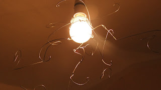

I really like this one, I took it by mistake with the camera on the setting. It doesn't really communicate my three words so I'm not going to use it as my final image. I am still happy with it, it looks like a dark tunnel.


I am pleased with the final images, although they have come out quite differently to what I thought originally.


I really like this one, I took it by mistake with the camera on the setting. It doesn't really communicate my three words so I'm not going to use it as my final image. I am still happy with it, it looks like a dark tunnel.


This picture is my favourite and I will be using it for my final piece.

Evaluation
BA (Hons.) GRAPHIC DESIGN
LEVEL
05
Module Code
OUGD202
Module Title
DESIGN PRODUCTION -
DIGITAL
END OF
MODULE SELF-EVALUATION
NAME
Sadie Thompson
1. What
skills have you developed through this module and how effectively do you think
you have applied them?
I have developed my skills on After Effects. Previous to
this module I had only worked very briefly with Flash, even then I didn’t feel
like I had learnt a substantial amount about the software. I now feel
comfortable enough to get on with using After Effects on my own, and can either
work out what I want to do or work from relevant tutorials. The thought of
starting a new After Effects project is no longer daunting to me and I am much
more comfortable using this programme.
I have also improved on my ability to storyboard and
realised the benefit of doing so. It has definitely made animating my sequence
a lot easier in the end and also allowed me to realise some faults before I
started to animate.
2. What approaches to/methods of design production have
you developed and how have they informed your design development process?
Storyboarding has helped me to get my ideas down
quickly, without having to work out how to animate them. This would waste time
and would make it more likely for me to forget some of the details of my ideas.
Storyboarding has been beneficial to me developing my ideas in detail and for
predetermining what could possibly go wrong. They have also helped me to
consider time, giving me a solid frame to start with. Title and actions safe
zones are also something that storyboarding has helped with.
I also found that the format of the workspace was a
tricky one to work with, as most of my artwork would probably work better in a
square format. However I had to consider that it could be viewed on either a
widescreen or classic framed T.V.
3. What strengths can you identify in your work and how
have/will you capitalise on these?
The strongest feedback I have received time and time
again in my crits is that both my idents and my title sequence reflect the
theme of my chosen channel, E4 and stays true to its style. I have used my
ability to work in Illustrator relatively quickly to my advantage, and vectored
all of my artwork to be used in my final sequences. I feel that vectoring these
images has kept the style consistent added to the general feel of my
animations.
4. What weaknesses can you identify in your work and how
will you address these in the future?
I feel like I could have come up with more initial ideas.
I seem to have come up with one general idea and developed and changed it as I
progressed and worked on more storyboards. I feel that I could have worked on
sound more. I am happy with the music track that I have used for my title
sequence, and all feedback that I have got in crits have said that it works
well. However I have just used the ending of the song in the ident, which also
works well and ties them to the title sequence, but I feel I should have added
some sound effects. I did try this initially but they sounded tacky, so I
should have either recorded the sounds myself or searched further for some
better quality sound effects.
5. Identify five things that you will do differently
next time and what do you expect to gain from doing these?
1.
Do more
contextual research to influence my style.
2.
Look at more
tutorials online, and ask for more help to find the most efficient ways to
animate on After Effects, rather than trying to work out on my own.
3.
Do more
initial ideas.
4.
Consider
recording my own sound effects rather than just looking online.
5.
Manage my
time more effectively so that I can get both my final designs and blogging to a
good standard by hand in.

Tuesday, 7 February 2012
Monday, 6 February 2012
Top 10
I have added sound to my idents. They are sound effects relating to each on along with a section of the song i have used in my title sequence. Even though initially the idea of using sound effects seemed like a good idea, in reality it doesn't seem to work and just sounds tacky and unprofessional.
Instead I have decided to just use the section of the song which works well on its own and ties the idents in well with the title sequence.
Saturday, 4 February 2012
Top 10
I have tweaked and tried to perfect my idents. I have sorted out the timing, and also moved the E4 logo about a bit to sort out the composition. I made sure that the logo bounces in at the same time on each ident as well to keep them consistent.
I also managed to finish my final ident relatively quickly.
I also managed to finish my final ident relatively quickly.
Friday, 3 February 2012
Top 10
I have added the next step from my storyboards. I still feel like the pace isn't quite right and things are panning away far too quickly. I am going to get all of the basic animation done and then work on the pace afterwards.
Top 10
Today I managed to add the next scene on my title sequence, the girl throwing up into the toilet (nice).
I think I over thought the way I was going to do this and it just looks messy, I should have probably kept the hair and face on the same layer. It doesn't look smooth enough and it is really obvious that they are all on separate layers.
After rendering this out, I also realised that the camera pans over far too quickly. I tried to adjust this, but because there are too many different layers making up the artwork it went all over the place. I decided that its best to just start over.
This time I kept it simple, dividing the scene into just four layers and keeping the motion to a minimum. This looks much better, and far smoother.

Thursday, 2 February 2012
Top 10
I have been working mainly on my title sequence, as I think I should prioritise getting this done before the deadline, and my final ident shouldn't take too long after this.
I have managed to get the next 6 seconds done, I have been working alongside the beat of the music. I have tried to keep the motion of the piece quite fast paced and dynamic to suit the song.
I have added the scene with the girls dancing, with the disco lights on them. It looked strange just having this, so I decided to add a disco ball.

After rendering this file out, I realised that the lights were only shining on one of the women so I had to change around the order of the layers.
Again in this scene, I have used the null layer to zoom in and out and change the camera angle.
2D to 3D to 2D
Today we expanded on the previous brief. We were given back the original object that we came up with last week, mine being lamp. We had to come up with a random adjective and verb. I chose hanging and curly. We had 10 minutes to illustrate this...

Our brief for next week is to recreate this in three dimensional form and present it in 2D. My initial idea is to wrap curled wire around a lightbulb, hang it from the ceiling and photograph it. I could also create a lightbulb shape out of wire, hang it and light it from behind.


Here is my rational.

Subscribe to:
Posts (Atom)