Wednesday 23 May 2012

Secret London... Digital advert

My proposed digital adverts, stills taken once every second.

how to make a gif

gif maker at gickr.com

how do you make a gif at gickr.com

make a gif

gif maker

Secret London... Digital advertisement

I have mocked up some stills for my digital advertisement. I have do one frame per second, as it will be five seconds long.


I think they are looking good, but it seems top heavy before the title comes in. I will either be close up and  zoom out as the title comes in, or keep the title throughout.


I think that having the title from the start works well and evens the composition out. It also gives the viewer longer to take in the heading and website.

I have experimented with the other colours from all categories to if they could also work... perhaps having a range and they vary across different advertising spaces.


Some colours are too light... pink, grey and light green. The colours I like best are the red, burgundy, blue and turquoise. These colours look good as a set as well.

These are the four that I will propose on my boards.


Wednesday 16 May 2012

Secret London... Final Crit

I'll admit, I definitely didn't have enough work for a final cit. Nonetheless I have had some great feedback and know exactly what I need to get done for the module deadline.

Here is the feedback that I got from people that know nothing about my project and were looking at it with fresh eyes. They got the concept relatively bang on, which is mean I am communicating my concept effectively.


 I especially like the idea of producing some kinetic type for the electronic tube ads, I may not have time to do this so close to the deadline, but I will do some storyboards and propose this idea at least.

I also got some extra feedback from my usual crit group, which also proved helpful.


Action Plan...

Secret London... Website development

I have started to draw up my scamps on Illustrator.

I started by following the scamp quite accurately, but I think that it will look better with just the buttons down the left hand side, and the smaller links at the top of the page.

I have used a light grey colour to go with my Secret London branding. This colour scheme also keeps to the original, but making it much lighter and appealing to look at.

I have added some initial text to the home page just for layout purposes for now, I will probably end up editing this.

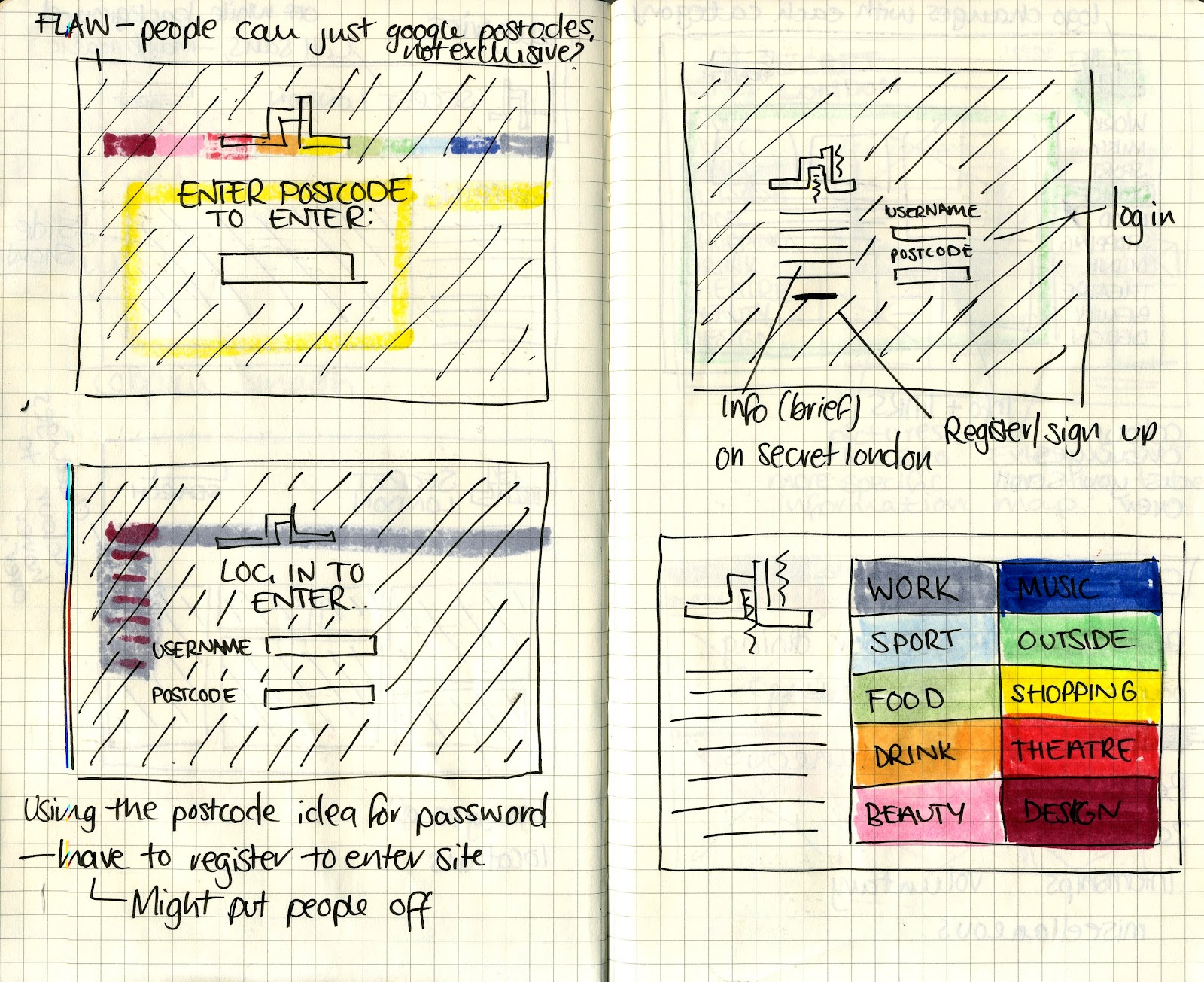
Taking influence from the London Tube map, I have drawn up some of the separate pages of the website. I have kept to my initial colour scheme, with the logo at the top and the button changing colour when it is selected.

I think the logo looks far better without the type, so I'm going to leave the header separate. 

In the top right I have added a search bar, this will make it easier to navigate around the site as their is a large amount of content. I have also added links for the home page, contact, discussion forum (more details of this will be displayed in the homepage, and the index page, which is another element to make the site more user friendly. 


Tuesday 15 May 2012

Secret London... Website design

I have drawn up some initial designs for my webpage. I have focused it around the colour code that I have used for the different categories. My main issue is trying to make it as easy to navigate as possible, as their is a lot of information, and should probably also include a discussion forum.

 I have focused on doing some designs for each of the button pages, the home page and the sign in page. I think that their should be a sign in page before being allowed to enter the site to keep the exclusivity of the group.


 The design that I have decided to take further is the one that uses the London tube imagery. I like this as it keeps that navigation relatively simple, yet the visuals are interesting, with the colour change and tube line outlining the sub categories.
 Homepage.

Secret London... Logo range

I have started to vary the colours of my logo, this is for the different categories so that I can filter my target audience, and the consumer can find the type of location that they are looking for with ease.

I have chosen to use the colour scheme used on the lines of the tube, as it is directly related to London, and as my logo is influenced by the London tube map, it ties in with the brand.
I have started to experiment the layout of the logo with the categories. This has been quite hard to keep consistent as they are all such varied lengths. I am only doing this for the sake of the website, but the stickers will probably only have the coloured logo to keep the secretive appeal of the brand.

Final logos...

I swapped around the shades of the top two sections of the logo to make it more consistent with the main logo. I think it also defines the shape of the L more.