Me and Francesca have started brainstorming our ideas for the promotional material for inpress' next event. We want to incorporate the three fluorescent colours used in our business cards and branding.
To keep costs down we thought that digitally printing greyscale and then adding spot colours by screen printing would be a good idea.
We intend to produce posters, flyers, stickers and possibly some packaging for our prints that ties in with our promotion.
Form~Writing are guest designers at our event and have agreed to design a typeface for us, so we will be incorporating that into our designs.
Wednesday 31 October 2012
Monday 29 October 2012
Aztec
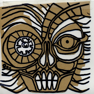
Since finalising my brief with Will, I have been experimenting with different styles that would be fitting for the Mexican restaurant. I started drawing out an Aztec looking face.
I layered different materials to try and get an idea of how it would look once using perspex and wood.
I don't think this is quite right, and I feel that I haven't translated the correct style. To me this doesn't communicate Mexico at all, if anything it actually looks a bit like an African mask. I think I'm going to stick to the sugar skulls and day of the dead, and develop from there.
I layered different materials to try and get an idea of how it would look once using perspex and wood.
Friday 26 October 2012
Marbling
Today me Niall and Max marbled some paper. It was an initial idea for the branding and promotion for the next event for inpress, but really it just ended up loads of fun. Some came out really nice as well.
Final publication and business cards
Here are Niall's final publications, which we gave out at Creative Networks and the inpress business cards designed by Niall and Kirsty.
Thursday 25 October 2012
Tuesday 23 October 2012
Finalising the brief
Will has found the perfect place for us to design our interior. It is a Mexican restaurant on top of a bar called Escobar. The manager is currently in need of ideas and designs for refurbishment of the restaurant area. It needs to be Mexican themed, and in light of the Mexican holiday day of the dead coming up, he would like the walls redecorated with murals and some art pieces to hang on the walls.
Even though we are straying away from retail, we are still focusing on interiors and it relates to our subject matter of skulls and anatomy. We intend to kick start our research by looking at day of the dead holiday and festival and sugar skulls.
We have rewritten our final brief.
Restaurants accommodate customers by providing a full experience to eating out, It's not just about the food, but instead about the experience as a whole, how the food and environment come together to provide an overall aura . Explore how retail graphics, installations, exhibitions and way finding are used within a restaurants interior to suit and compliment the surroundings.
-A mixed media investigation of retail graphics and shop interiors with a focus on Mexican food, the mexican day of the dead, sugar skulls and Mexican themed subject matter. Using screen-print and laser cutting we want to look into multi-layered posters, wall hangings and 3 dimensional pieces of print. This will be proposed to a high street shop tailoring our ideas to a specific audience.
Skill set: Digital Illustration, Hand Rendered Illustration, working to exhibit, screen-printing, laser-cut.
Deliverables;
-A proposed Interior restaurant Installation.
-Backdrop of a Map (wallpaper/print)-5 A1 mixed media prints.
Saturday 20 October 2012
Dock Street Market
After talking to Jake from Dock Street Market concerning using their gallery space for the next inpress event, we decided to all go down there to have a proper look around. It's pretty perfect for our event, the back is divided into two sections, so there will be room for the band. They also agreed to close it off for the private opening on the Friday and have the shop open to the public across the weekend. Niall's brother has agreed to play for us for free with his band and we all love the sound of his music.
Friday 19 October 2012
Tengu Kami
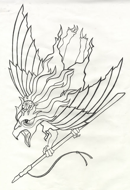
I have been researching into the Japanese Shinto faith to inform my designs for the Japan Matsuri brief. My research started off quite broad, but I managed to narrow it down and I have chosen five main Kami to start illustrating.
I have started off with Karasu Tengu, who is a crow like monster, that has both human and avian characteristics. I began by illustrating by hand and then experimenting with different textures and paintbrushes digitally.
I have started off with Karasu Tengu, who is a crow like monster, that has both human and avian characteristics. I began by illustrating by hand and then experimenting with different textures and paintbrushes digitally.
I'm not sure it's turning out how I originally intended and it needs a lot more work. I think I need to stick more to the traditional Japanese style rather than the modern. Also, I've got it into my head that this depiction of the Tengu looks like a Pokemon (and the name sounds like one too). So I'm going to try some different approaches and look at more traditional Japanese art for influence.
Thursday 18 October 2012
Bookmark

After my crit with Andy and talking to the rest of inpress, we decided to print a bookmark to go with our publication instead of more posters. I worked out that I can do this without making up another screen, which will save time. Also I can produce three bookmarks from every sheet so won't have to print all fifty. I am going to print on a thicker, probably off-white stock, depending on what I can get my hands on by tomorrow.
Wednesday 17 October 2012
Spur magazine
Spur is a new magazine that is going to be launched at the end of November, just before our event. They have asked to interview us, and if we could design a poster and print 150 as a free pull out to accompany the magazine. Although they don't have the funds to pay us for our time, they have agreed to cover our costs.
We had the interview a couple of weeks ago, which went really well, and gave us the opportunity to talk about our next event and what we plan for the future. It also even helped us to establish between ourselves what we want to get out of Inpress. It is pretty clear that this is something that we want to carry on beyond graduation, whether it be full time or along side other independent work.
For the poster, me and Francesca created the image together and then Niall and Kirsty applied the type.
As Spur didn't have any specifications for the poster, we had freedom to do anything that we want. This was actually really difficult. So we started off with some sketches that Francesca had been working on for another project.
We have decided to screen print the image, with 'inpress design' over the top. We have chosen bright white light weight stock, as it is cheap and easy to fold into an insert for a magazine.
We have chosen to print onto slightly smaller than A4, so that it will fold over and insert easily into the zine, which is A5 format.
 The idea is to screen print the pattern with multiple fluorescent and bright colours, as this ties in with past Inpress promotional work and also with mine and Francesca's initial ideas for the promotion and packaging for the next event.
This is the mock up that I sent to Spur to OK before we went to print. They like it, but would rather we got rid of the type on the sides as it currently look too busy.
With the go ahead, we decided to go to print. Both us and Spur are really pleased with the result, and we plan to print an extra 50 to put into a publication that we are designing to give out at Creative Networks.
We had the interview a couple of weeks ago, which went really well, and gave us the opportunity to talk about our next event and what we plan for the future. It also even helped us to establish between ourselves what we want to get out of Inpress. It is pretty clear that this is something that we want to carry on beyond graduation, whether it be full time or along side other independent work.
For the poster, me and Francesca created the image together and then Niall and Kirsty applied the type.
As Spur didn't have any specifications for the poster, we had freedom to do anything that we want. This was actually really difficult. So we started off with some sketches that Francesca had been working on for another project.
I then worked on them in Illustrator, and came up with this geometric pattern.
We have decided to screen print the image, with 'inpress design' over the top. We have chosen bright white light weight stock, as it is cheap and easy to fold into an insert for a magazine.
We have chosen to print onto slightly smaller than A4, so that it will fold over and insert easily into the zine, which is A5 format.
 The idea is to screen print the pattern with multiple fluorescent and bright colours, as this ties in with past Inpress promotional work and also with mine and Francesca's initial ideas for the promotion and packaging for the next event.
This is the mock up that I sent to Spur to OK before we went to print. They like it, but would rather we got rid of the type on the sides as it currently look too busy.
With the go ahead, we decided to go to print. Both us and Spur are really pleased with the result, and we plan to print an extra 50 to put into a publication that we are designing to give out at Creative Networks.
Saturday 13 October 2012
Retail Graphics
Yesterday me and Will went around town to photograph some stores and talk to some people that work there to find an appropriate setting for our concept. The places that stood out the most for us were Urban Outfitters and Republic, mainly because they both had wall space that would be fitting to the big wall piece that we intend to design. Also the existing wayfinding and infographics around both stores would merge well with our subject matter. In Republic we would want to redesign some of the signage, and even some of the staff members mentioned that they think that there is an inconsistent theme throughout the interior design.
In Republic we found out that the head office is based in Leeds, so the idea is to create some concept boards and go there to see what they think.
Urban Outfitters
Republic
We also went to Best, a small clothing store. They seemed pretty up for having some of our work about, and had some good wall space. However, they seemed to want more one off art pieces rather than a redesign of their retail graphics, which is not what we are looking for. Also their style isn't as fitting as some of the other places that we have looked at.
We also looked at On the Wall, but just like Best they seemed to want art pieces to put up, they were after a sign, but wanted to keep to their existing design, so nothing really wanted redesigning.
A shop window display that we came across that we found quite interesting. Just a display of how abstract and creative we can be with our retail design, as long as it's original and stands out from other stores.

Beneath the glass floor there were steps leading down to the remains of a human skeleton, under your feet as you walk in.
 We really liked the wall paper, which the staff told us was made from photocopies of an old newspaper, so was really cheap to produce.
In Republic we found out that the head office is based in Leeds, so the idea is to create some concept boards and go there to see what they think.
Urban Outfitters
Republic
We also went to Best, a small clothing store. They seemed pretty up for having some of our work about, and had some good wall space. However, they seemed to want more one off art pieces rather than a redesign of their retail graphics, which is not what we are looking for. Also their style isn't as fitting as some of the other places that we have looked at.
We also looked at On the Wall, but just like Best they seemed to want art pieces to put up, they were after a sign, but wanted to keep to their existing design, so nothing really wanted redesigning.
A shop window display that we came across that we found quite interesting. Just a display of how abstract and creative we can be with our retail design, as long as it's original and stands out from other stores.
We also came across a small clothing store in the arcade that follows a similar style that we are after. They use quite a lot of earthy, natural colours and have a lot of wood throughout the store. They also have a massive skull of a buffalos head on the wall, which is really cool.

Beneath the glass floor there were steps leading down to the remains of a human skeleton, under your feet as you walk in.
 We really liked the wall paper, which the staff told us was made from photocopies of an old newspaper, so was really cheap to produce.
 Tuesday 9 October 2012
First Crit
Today we had my first group crit with Fred. To prepare for this I filled out my rationale and statement of intent. I found both Freds and the groups feedback really useful, and I left the crit feeling positive and motivated. It was also great to hear what the others are up to, everyone seems really passionate and ambitious with the briefs that they are working on.
My initial rationale and statement of intent.
My initial rationale and statement of intent.
Sunday 7 October 2012
Initial sketches
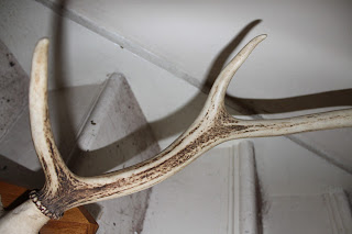
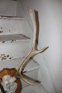
This weekend I started sketching for mine and Wills collaboration project. Today we worked together, and managed to get some antlers and animal skulls to draw from first hand.
Lamb skull.
Rabbit skull.
Antlers.
I also drew some studies of the bear skull from the discovery center, and experimented with a couple of different styles to get an idea of what direction me and Will want to go in.
Lamb skull.
Rabbit skull.
I also drew some studies of the bear skull from the discovery center, and experimented with a couple of different styles to get an idea of what direction me and Will want to go in.
Subscribe to:
Posts (Atom)


