Thursday 29 March 2012

Image... initial sketches

My initial sketches of my Native American illustration. I'm not sure on how it's going, there's a few things that I want to tweak to get a consistent style throughout all of my illustrations for this project.


Wednesday 28 March 2012

YCN... Submission

Me and Baljeet have just submitted our final boards to YCN. We had a last minute spell and punctuation check and we believe that it is free from typos. After Baljeets brief panic attack and excessive screen shotting we managed to send off our final submition, and we are both really happy with our outcome.


YCN... Final crit

Yesterday we had our last crit on our final design boards. There were a few imperfections and we later tweaked them a bit, but otherwise we are ready to submit. 


We have cleared up the first board a bit so that it doesn't look so busy and is kept concise. We also kept the House of Herlihy/ Lola&Grace logo consistent on each board. After realigning a few things and tweaking the layout we are both happy with our final boards. The plan is to submit them at the end of today.

FINAL BOARDS

We also spoke Jane and John following the phone call I received from Kala concerning our packaging designs. They both gave us some great advice, I am now just waiting to hear back.

Monday 26 March 2012

YCN... Packaging pitch

I received a phone call today following the pitch me and Baljeet sent to project manager of Lola&Grace, Kala Patel. It was from Kala saying that she really liked our designs and would like to consider our proposal. Exciting stuff!

She asked me some questions about mine and Baljeets collaborative project and YCN and asked me to send her some photos from Sineads shoot. I done so and she is going to speak further with marketing and get back to me.


YCN... Design boards

Here are the design boards that me and Baljeet have initially designed. I am really happy with them as they are, but will respond to any feedback on Tuesdays crit.


Saturday 24 March 2012

YCN... Final fashion photographs

Sinead sent me and Baljeet the final photographs from her fashion shoot, their are some nice ones that include the jewellery which is great as they will look good on our design boards and I can forward them to Kala at Swarovski. Sinead also sent us some of her initial sketches of her line, which will also look great on our design boards.


Tuesday 20 March 2012

YCN... jewellery samples

We sent the jewellery samples back today, so we counted everything and compared it to the inventory to double check it was all there. Unfortunately we didn't get to photograph the bracelet with the packaging as we only got it back from Sinead today. So we packaged it all up (after Jane had great fun trying it all on) and took it to the post office.


YCN... Final photographs

Today me and Baljeet chose our final photographs to use on our shop front and design boards. We chose six close up shots of just the jewellery for the shop front, to accompany the pictures from Sinead's fashion shoot on Friday. We then chose a variation of six photographs of the packaging and jewellery together.

We touched them up in Photoshop to get rid of any imperfections and make them all a similar colour, as most of the originals are too yellow.


Monday 19 March 2012

YCN... photos

We rented out a camera and some lights from the photography department and photographed our packaging with the jewellery. Beth also kindly modelled some of the jewellery for us, so that we have some close up shots to use in our shop front design. here are the best of the pictures that we took.


I have selected the images that I think that we can use in our shop design and on our client boards and touched them up in Photoshop to give them a professional finish.


YCN... shop front

After working on our own shop front designs, me and Baljeet put our ideas together and mocked up some initial designs together. We are still waiting for the photographs from Sinead and we are photographing the packaging and jewellery together later today so we have worked with images we have so far.

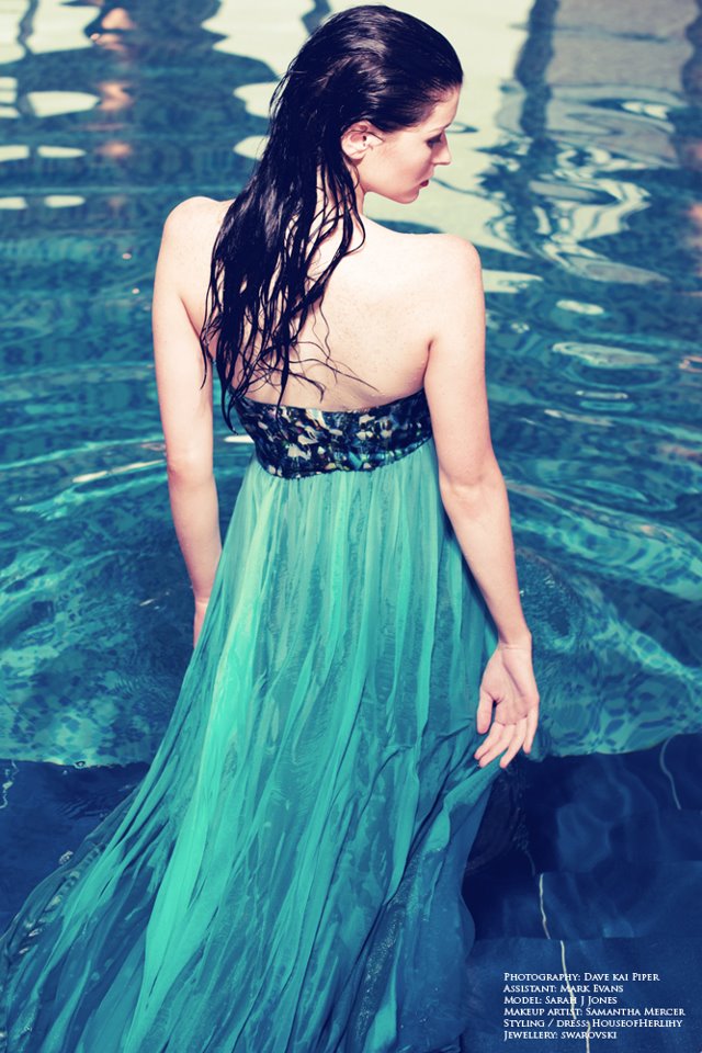
Here are the photographs that we have so far from Fridays shoot. They are looking great and work really well with the image that we are trying to create for the joint store.


Our initial shop front designs...


Me and Baljeet both agree that although the blue and orange colour scheme looks really good, it doesn't really go with the pink ampersand in the logo. So far we have worked with the limited images that we have so hopefully we will get some more variation to work with once the rest of the photos are finished.