Tuesday 27 November 2012

Design for Print

Press quality PDF is suitable for commercial print. Smallest file size is OK to send as a proof. High quality print is good enough for our laser printers as a hard copy, but not good enough for commercial printing.


The press quality settings doesn't include a bleed, so we need to remember to add one, and crop marks.

Create a postscript file through the print menu to save your file exactly how it would print. This only works with laser printers, not inkjet. Separations are also possible when using a postscript file, this would be useful for screen print.

Adobe Acrobat Pro is useful for editing your PDFs, anything from deleting pages to editing the content.

Acrobat distiller changes postscript files to PDF.

When numbering pages on InDesign, you can also save the postscript file with the re-ordered pages. Convert the file on Adobe Distiller before sending to a commercial printers.

To save a postscript file with multiples of the same design on it, including bleed and crop marks. Firstly save the document to press quality and then create a new document to the paper size you will be printing. Then place the postscript file into document.


A quick way to repeat the image is to go to edit, step and repeat.


Use the grid option, and input the size of the image in the offset.


The all you have to do is align to page.


Just one problem, there is a spelling mistake. There is a quick way to rectify this. Delete the repeated images. Place file, select the InDesign file and select show import options.

Make sure that you include the bleed.


However there is nowhere to add crop marks, so we will have to do this in the original InDesign document. 

Document setup, add a 10mm slug. This will add a blue margin, add some guides, and simply use the line tool then save. Then place and include slug.

These images now show up n the links panel, so if we edit and save the original document to change the spelling, then it will be edited in the final document after double clicking the yellow triangle in the links panel.


Work and turn is when printing double sided, is flipping it horizontally. Work and tumble id vertically flipped. 

Friday 16 November 2012

Design for Web

Select manage site, choose your root folder and select to edit. Open up your index.html folder and double check that the site is still working.

By default your site will appear to have a small white border, but you can get rid of this. 

The container is what contains the whole screen. The problem is that 'realtive' positioning will create this border.


Delete position:relative; float:left; and replace with absolute top:0px; left:0px; this will align it to the left of the screen.


However if you want it to sit in the centre of the screen, code the following. The margin left is half the width.


Instead of retyping our index.html for every page, we are going to create a 'DWT' (dream weaver template) file. Normally you would create this first, before the index. To edit all of the pages, all you have to do is edit the template. 

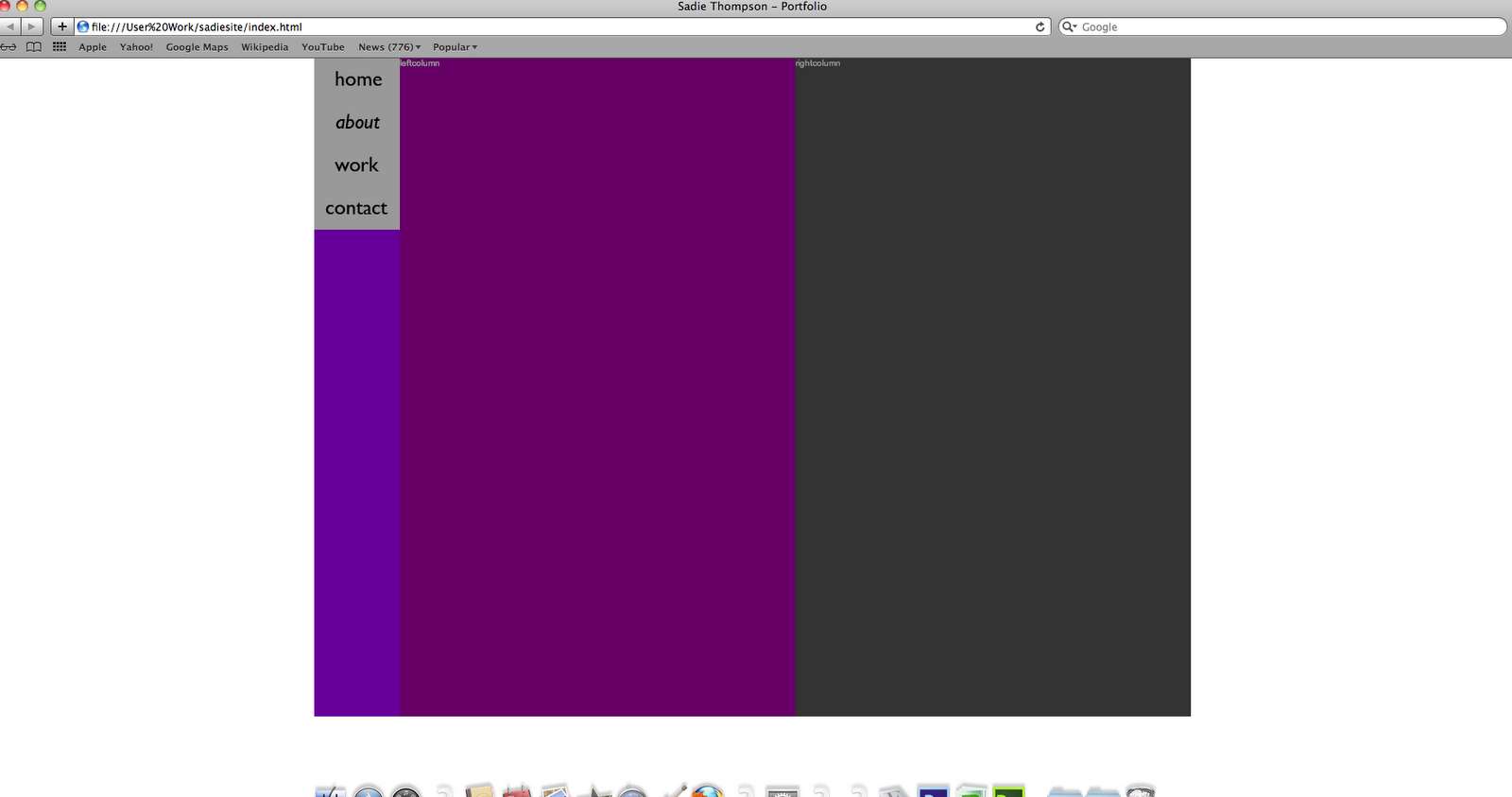
You determine which parts are going to be editable, the 'editable region'. The navigation is going to remain consistent throughout the site, so we want the left and right column to be editable. 


It doesn't especially matter what you call the region, because we have two columns, leftcolumn and rightcolumn will do (no capitals or spaces). Go on to insert, template objects, editable region. It should look like this. 


If there is a glitch (like there was this time!) and the code appears in the wrong place, you can cut and paste, but not copy and paste.

At the moment this is still a html file, not a dtw file. File, save as template.

If asked to update links, click yes, to change editable areas.

Your new template should now show on the right.


Our index wasn't made from the template, so won't change when we edit the template. So delete it.

File, new, page from template, create.

Save as index.

Now repeat for, contact, work and about.


Next we are going to make our buttons to navigate and link the pages together.
Most websites use rollover buttons to give the user an indication that it is there. The simplest is to underline, italics, slight colour change, change of text, a shape appearing etc.

For this we are going to use Photoshop. Create a new file, to the correct dimensions (100px by 50px). 72 dpi, RGB. For the background colour, if you are just working with solid colours, then just make it transparent and then add when coding to reduce file size.

In Photoshop create the button, and the rollover image on different layers . save for web and select 4-up. 

Select the layer you want to save and hide the other.
If working with a transparent image, save as png-24, but for any type of image use jpeg. Save, always keep the fie extension (png). home1.png. Now do the same with rollover. home2.png.
Now the same for other buttons.

Go back to dreamweaver and select template file. We inly have to create the buttons in the template to add them to every page.

The only way to create a rollover button, we need to we javascript.

Th firt button s going next to navigation. Insert, image object, rollover image.


Save as home button and add image and rollover image. Keep preload rollover image checked.

Alternate text is what is searchable by search engines such as google. The law is that anyone can use your website. By giving images alternate text, a screen reader can use the alternate text. Home button. When clicked... browse... index.html.


Lots of code!


Where highlighted, movethe <div> down a couple of lines to separate each button, and add the rest. File, save as and then save all.


Refresh the web page to check it.


On each page, where it says left column, type in homepage, contact page etc. 


To border your columns, we use a box model.


Avoid using margins, because it complicates things, try to use padding instead.

We are going to work in the style sheet for this.
Add 10px padding in left column.

This initially throws everything off and will probably pus the right column off the side, because the width is now greater than the container. We now have to minus the padding off of the column width and height. (20px, 10 for each side).


Now do the same for the right column.

Add an image by putting it in Photoshop and make it the correct size and resoultion. Jpeg, 442px, 72 dpi. Put into root folder and click into right column, and insert image. 


Wednesday 14 November 2012

Calendar, initial sketches

I have designed a basic A5 layout for my calendars, and drawn my initial illustrations displaying my chosen quotes.


Laser cut skulls

Me and Will have experimented with laser cutting skulls and other various designs that we have done for Escobar Cantina.


We experimented on a range of materials, I really like the effect on the black perspex, but it is more fitting to stick with the wood, keeping the design work more consistent. I think I'm going to stick to laser cutting skulls into wood and then screen printing colour over the top.

We had a bit of trouble with working out how to etch as opposed to the cutter just following a vectored outline. Luckily however, we managed to get some help and it worked in the end.

Sunday 11 November 2012

Sticker Paper


I have been on a search for eco-friendly sticker paper for my calendar design idea. The main problem is the adhesive used on the back of the paper, preventing them from being biodegradable. I have found a website that stocks sticky labels that can be recycled or used as compost, they use 'a permanent acrylic adhesive, emulsion based, designed for biodegradable roll label constructions, offering a perfect combination of quick tack and shear resistance, and an outstanding adhesion to most substrates.' The only problem is that they are already cut down to size, not leaving me much room for design. 


I have looked around for different types of sticker paper, and self adhesive paper that is environmentally friendly. There just seems to be a major lack of it. As this is something I want to actually make and send to studios, and not just mock up, I want to be able to practice what I preach and actually use sustainable materials. As for this design idea sticker paper would make up pretty much the whole product, I just don't think it's a great idea after all. 

Saturday 10 November 2012

Inpress posters

We have received some feedback on the Inpress promotional posters. Generally people have liked the overall look and layout, just some tweaks to the lettering need to be done. Luke and Charlotte both recommended that we work to a stricter grid. So me and Francesca have altered them slightly. The stock was also received quite well, the favourite being the sugar paper.


Friday 9 November 2012

Sugar Skulls

For mine and Wills project I have started drawing out skulls. This is to complete one of the pieces for the Mexican restaurant. My idea is to have a sketch of a skull etched into wood, and then the sugar skull pattern screen printed over the top.


Original skull drawing, and the pattern to be screen printed over the top, with colour separations...


 Mocked up on illustrator....

I then experimented with different colour combinations and a wood texture..