Thursday 27 October 2011

What is design for print?

I have changed the general look of my Issuu design, going for a more classic CMYK theme with gradients. I am a lot happier with this, all I need to do now is fill it with information.


Wednesday 19 October 2011

Good is...

Today we had to have in four concept boards to aid us in our presentation. The concept boards had to  outline what we intend to do in our project and explain what research and contextual references we had that took us to our current ideas.


Duffield's print visit


Tuesday 18 October 2011

Good is... Tribal body modification


Why?
1. Every process has a story and meaning behind it.
2. It is a mean of communication between tribes people.
3. It is visually beautiful and unique to traditions in the western world.
4. Todays fashion and trends in our culture are increasingly influenced by tribal wear and body adornment.
5. To become more aware of such practices is to broaden your cultural knowledge.

I intend to...
Promote a carnival celebrating the traditions and practices of African tribes people, focusing on body modification.

...to a group of...
people that are interested in world culture. My audience would be similar to that of Notting Hill carnival. Also to body modification enthusiasts, everyone who is interested in anything from henna tattoos to scarification.

...that...
Not all body modification is gross and over the top, it can have culture and meaning and can be truly beautiful.

In order to achieve this I will produce...

PRODUCT
Illustrations influenced by my research on poster format, contained in packages that also include a keepsake and information pack to be given out either before or at the carnival to promote.

RANGE
I will produce a range of illustrations to display on the posters and different information packs to accompany each one.

CONTEXT
The packages and posters could be sent to schools and universities to promote the event,  and also given out or sold at the carnival to educate and as a souvenir. 

InDesign: Eight mistakes

We have been set a task to spot the eight mistakes in an InDesign file. We have been told that when printing no more than five plates should be used. Here is what I have found.

One of the colour swatches is set to RGB, which is not a massive problem because InDesign automatically converts everything to CMYK. Although when it comes to printing there may be a colour shift so it's best to keep everything in CMYK mode from the set off. This colour swatch has been used quite a lot throughout the document as well, so it could cause a problem when printing.

Another mistake that I have found within the swatch menu is that there are colours that use CMYK but also an additional three spot colours. This means that seven plates would have to be made when we have been limited to five. This would be resolved by either converting these colours to CMYK or finding out which colours we haven't used within the document and deleting the appropriate swatches. If you go on 'select all unused' then it automatically tells you which colour swatches to delete.

One of the links are missing from the document, meaning that it doesn't contain one of the image files. This cannot be resolved by us because the image literally doesn't exist anywhere on our computer. In this case the printer would have to get in touch with the client so that they can get the original image.


On the last page the registration swatch has been used for the type as opposed to black. This is normally fine because it creates a richer black. However when checking in the separations preview I found that it has exceeded the ink limit. This would be solved by simply changing it to black.


The bottom image is pixelated, this is because the resolution is set to 72 PPI when it should be at 300.

On the first page the background colour is only filled into the border and hasn't left any room for bleed.

One of the images is set to RGB colour mode.


One of the images is a large file size and has the wrong dimensions in comparison to the other images.

Thursday 13 October 2011

Typography

Today we focused on what the eye sees and how brain processes it. The idea is that your logic tells you one thing like we automatically read left to right and up to down, but our eyes work independently from our brains.
 We also learnt about kerning (the spacing between individual letters). When kerning you look for the biggest space and work with the rest of the letters from that, and don;'t reduce any spaces.
One thing that increases the readability of type is changing it to lower case.
e.g.
ONE
TWO
three
FOUR
This gives us more control over which word is read first.

An amazing tip that Graham gave us is the correct way to break a sentence into two or more lines- You break it where you pause in speech, or where the 'comma' would be if you like.

How do you break a sentence (pause)
into two lines?

During this session we experimented with where you place type on a page, and different ways to manipulate the eye to read in the order that you want.

Here is an example of our experimentation with kerning. The difference is subtle but increases readability. 

We then experimented with different ways to effect the order in which you read words on a page.


What is design for print?

I have started to design the general layout of my Issuu document on InDesign. I am trying to keep with the theme of CMYK as it is about print.

These are my ten categories or 'tips' that I have chosen.


  1. Processes
  2. Costing
  3. Finishes
  4. Artwork
  5. Formats
  6. Stock
  7. Software
  8. Colour models
  9. Converting to CMYK
  10. Designer/ printer relations


I definitely think that this design needs some working on as I am not entirely happy with it. It looks quite tacky and bit like a school text book to me.

Tuesday 11 October 2011

Good is...

Here is my developed and finalised logo, including my development. I have also experimented with some colour schemes. I have stuck mainly to browns and reds because I think that earthy colours communicate my tribal African theme.


I have used just two colours in each logo to stick to Fred's task. He has asked us to design three packages using two colours plus stock. To make the most of this limitation I have printed onto different coloured stocks to get a general colour scheme going. I think my favourite is the brown.


Print session


Design for print: InDesign


New document: make the document the finished page size.

Set a bleed size in case of any error when printing. A standard bleed size is 3mm.

Select 'facing pages' if producing a document such as a book or leaflet.

The shortcut for hiding all the guides when working is shift W.

Command < or > is the shortcut for changing the size of text.

Default swatches already use the CMYK colour mode.

The shortcut to change from stroke to fill is shift X.

You can swap between applying colour, the fill or the stroke by selecting the appropriate box.

Double click on a swatch to edit it.

All of the swatches in InDesign automatically have the same properties of a global swatch in Illustrator, which is indicated on both programmes by the small grey square.

You can make a new tint of a swatch by using the option in the drop down menu.

It's handy to set up a few tints of each swatch. Because they are all global, if the original swatch is edited then the tints are also altered.


To create a new spot colour, go once again to the drop down swatch menu and select 'new colour swatch'. Select spot instead of process and then you can also choose between PANTONE colours.
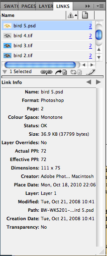
Preparing images to import into InDesign from Photoshop: Make sure the colour mode is set to CMYK or  grayscale. The resolution needs to be 300dpi. The image needs to be actual size, so that when it is placed into InDesign it is the size that you need it, this is because an image cannot be altered once imported. The image needs to be saved in the correct file format, a TIFF or PSD. When saved as a PSD the image still has layers, some of which can be transparent.. so if transparency is needed in this image save in this format.

Preparing images to import into InDesign from Illustrator: The colour mode needs to be set as CMYK, and the file needs to be saved as in AI format. The dpi is irrelevant as Illustrator works with vectors.

To add an image click on file and then place. If on your Photoshop image you have spot colours, the swatches are automatically added to your swatch palette in InDesign along with the image. The same rule goes for Illustrator files.


When placing an Illustrator image, the transparency is automatically maintained.

When importing files, you can edit how they are placed by checking the show import options selection. The options will then show once the image is opened.


Close up on the image it looks low res, but this will not effect the final print it is just a preview to keep the InDesign document a manageable file size.When printing, the images need to be saved as separate files which is linked to the InDesign file. Because the files are linked, you can go back to the original image and edit it and the modified version will also appear on your InDesign file.
The keyboard shortcut for editing the original image is alt and double click on the image.


If you are working with a TIFF file and you want the shortcut to open the image in Photoshop for example, click on the file and more info, then change the open with option to Photoshop.


If you are working with a grayscale image from Photoshop, you can also add colour on InDesign. If you select the image by clicking on the two central circles and then apply a fill, it will edit the image.


Separations: Information on what is going to happen to the image when it is going to be printed. If you print and click on output then select separations, it will show what CMYK and spot colours are going to be used and specify how much and where they are going to be placed. This can be used to check how many plates are going to be needed when sending to print.


Go onto view, output and separations preview. This allows you to show where each plate will be printing.


You can run the risk of having too many spot colours after all of the editing you have done to your design work. This would result in using too many plates that are not needed which can add to your print costs. Separations is handy to see which colours you actually need so that you can delete the unused spot swatches.


The default print setting for InDesign is that when shapes overlap, colours knock out eachother. Thjis is apart from black due to the fact that its so dense and covers the rest of the inks.


If you want the colours to print over each other to create an effect, click window, output and attributes. Make sure you are still on the separations preview and on the separation setting and all colours are selected. Then on the attributes bar select over print fill.


The downfall to this is that where the colours overlap, there is twice as much ink, which can cause problems when printing. If you select ink limit on the separations preview menu then it will show a red warning if you have gone over the top of the ink fill limit. This can vary between what media and stock you are using, so it is always best to double check with the printers.


An example of this being useful is f you want to add a varnish or special finish, then use a spot colour that has not been anywhere else on the and inform the printer that it needs to be a special print. However by default the spot colour would knock out the print underneath. So make sure it is on the right setting so that the image will show through the varnish.