Tuesday 25 January 2011

Collection 100... Initial Designs

I have started designing the inserts for the eggs by tracing 100 various sex positions on Illustrator that I found online...
I then proceeded to create a layout for the inserts that reflected the branding of the packaging. I designed two variations, a vertical and a horizontal to accommodate for the different sized and shaped pictures so that they wouldn't negatively affect the overall look of the layout when put together.
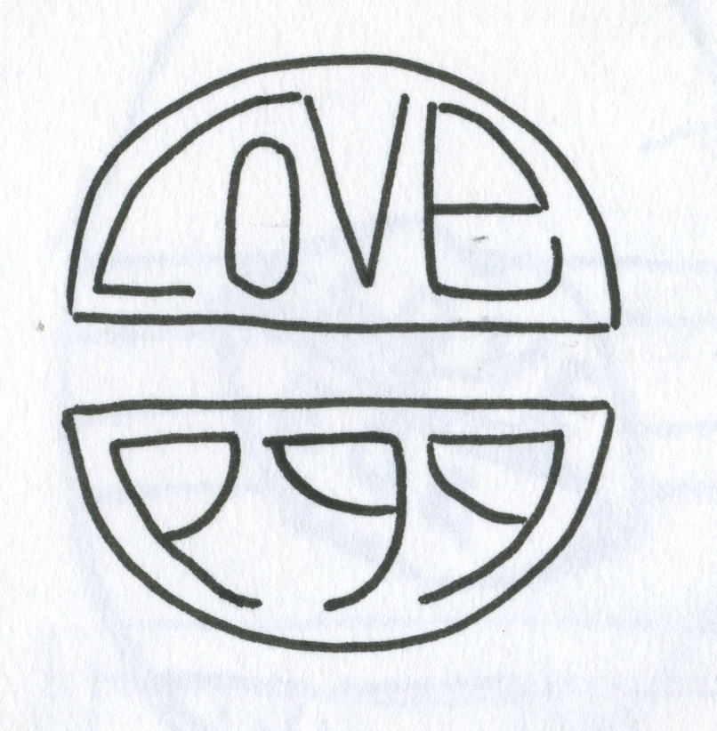
Here are some examples of the final designs put together, complete with quirky sayings and slogans to add to the novelty of the designs...
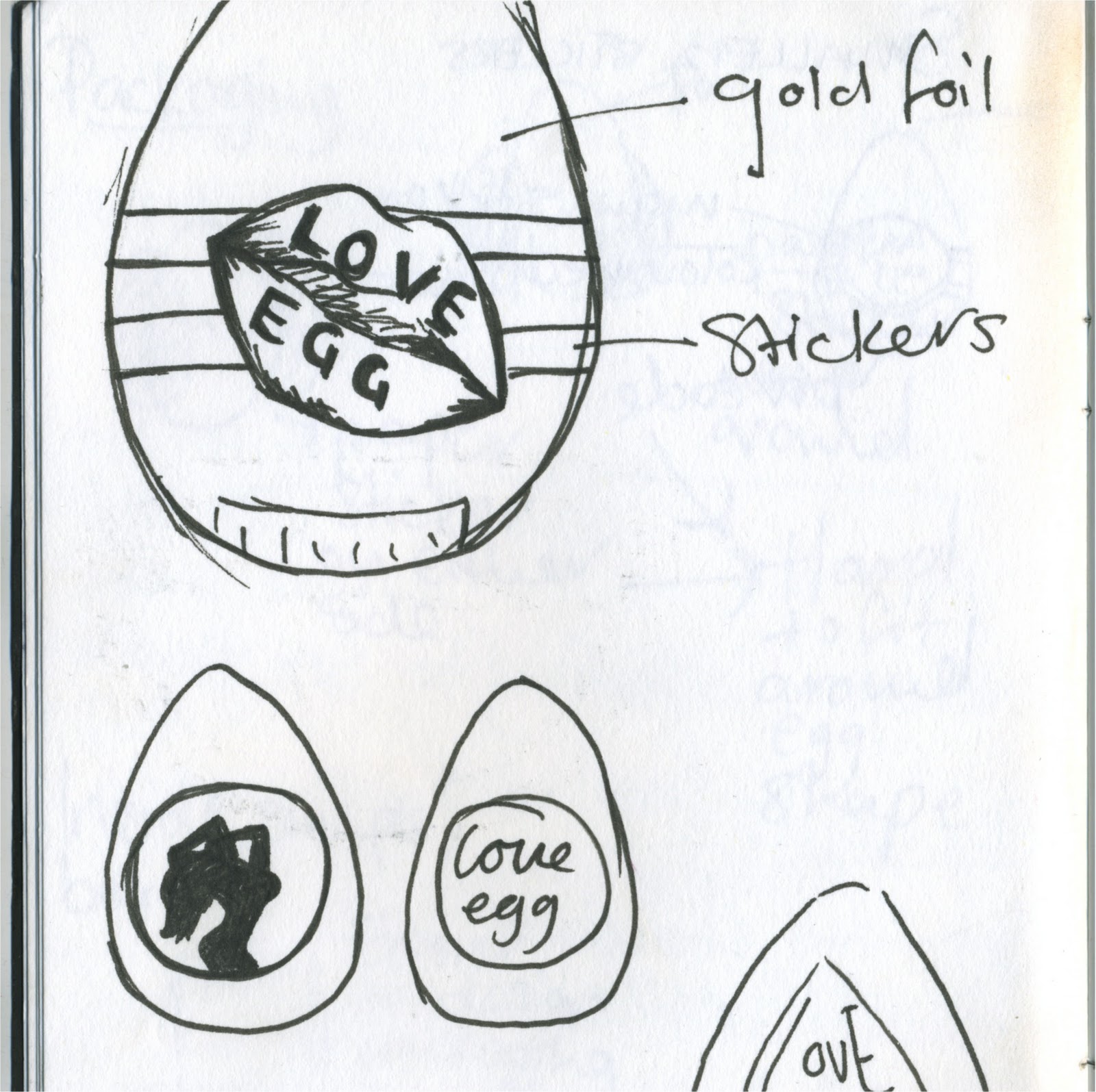
I have tried to spray paint some foil black for the packaging, nut i think this has turned out looking cheap. I may consider using black cling film instead.

Saturday 22 January 2011

Collection 100...

After having to change my subject due to my tattoo gun unfortunately breaking I started looking at Kinder eggs. I began by brainstorming and ended up by asking myself the question 'what would you not expect to find in a Kinder egg?'. I listed many things, but the one that stuck was condoms, which led on to the idea of creating a product called 'Love Eggs'. These chocolate eggs are going to contain a condom and one of 100 different sex positions inside. I intend to design and produce the branding and packaging for these eggs and also the inserts with the sex positions on.
Initial branding and packaging ideas...

My first attempt at packaging on Illustrator...
I chose to use a blue and black colour scheme- the black for the sexiness and the blue as a contrast but also, as I found from my research most sex toys and novelty items seem to be directed towards females. I want my product to appeal to both sexes therefore chose a more mutual colour scheme, I intend to get this design printed of as stickers to put on top of black foil.


Thursday 13 January 2011

Type and grid

In visual language with Lorenzo we looked at type and grid, and were taught how to work out the grid lying beneath a magazine or newspaper layout. 

We were set a task to take an existing magazine or newspaper spread that consists of both type and image, and redesign the layout.
 I began by drafting six initial ideas.
I then drafted my favourite design in more detail, also specifying different fonts used, point size of the type, colour and size of images.
To be honest page layout was never something I thought I would enjoy within graphic design, but I have a real taste for it now and cant wait to learn more on the subject and learn how to use the correct software to make it a professional, finished image.

Monday 10 January 2011

Collection 100...

After a lot of research I felt it was time to start getting my ideas down on to paper and start developing on them. My favourite idea is to tattoo fruit and watch them decay, also I like the thought of experimenting with tattooing different materials such as leather, fabric, leaves etc.

I also came up with the idea to create my own set of temporary tattoos, although this would be fun to do, I don't think it would be very successful as its been done before and it would be hard to be original with them.

Squares of food

I have decided that I don't want to use my original photographs of squares around college as they are bad quality and unoriginal. As an idea and a bit of development I decided to photograph squares of food to see how it would look.


Saturday 8 January 2011