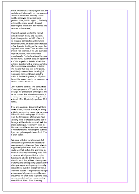
We were asked to add this paragraph into one column and then told the different elements that could be varied to fit it in, but still in a legible way. Leading was one of these, another is point size (an obvious one) and also font.
The ideal point size when working with narrow columns is either 8 or 9 points. This is to do with how you read the text, when you are reading a book or leaflet you hold the page quite close to your face so the point size doesn't need to very large.
The best way to judge the legibility of your text is to print it out and read it.
Never stay with automatic leading, if you vary it it always increases the legibility.
My first instinct was that the second column was the easiest to read, but when actually reading it to myself the third is. The best way to test this is to simply read read it!
A normal sentence length is around 14 words, so the fourth column is harder to read. The beginning or end of the sentence is close to the edges of the columns which gets confusing. Also, because the lines are so long you end up losing your place.
You never go beneath 5 or 6 words per line for readability.
We were told to adjust the...
Font:
Weight:
and alignment:
Embo is a good sans serif font to use that doesn't use a lot of space. Avante garde has a very large X height so takes up a lot of space.
Left align is also known as ragged right.
The next one is justified.
Right align is also known as ragged left.
Using what we've been taught so far this lesson we were asked to fit a paragraph into one column. Straight away I changed the point size to 9 and then adjusted the leading to 11.3 so it filled the column.
One of the rules of readability is not to go into negative leading.
This is the same chunk of text. The one on the left looks more appealing to read because it looks like less text. Rules like this can be used differently depending on your purpose, whether or not you want the text to be read.
A way to get around this is by indenting where the next paragraph begins. This stops the chunk off text looking so hefty and directs the eye where there is a break in the text. However it still does not look as readable as the column on the right.
Don't use an indent and a line space at the same time, this would indicate two pauses- keep it simple.
When indenting the paragraphs 3 characters (not millimetres) is normally about right.
When choosing a font to use consider not only what it looks like, but how much space it fill, how much white space it leaves, how big is its X height and so on.
The 'colour' of the page effects how you look at it. If you use a denser font then it's darker and lighter if less condensed. The tonal value of the page can be controlled by point size, density, font etc.
We then were asked to add a picture into the mix.
When you are adjusting the leading, you should go around two points more than the point size e.g. text size 10 Leading size 12.


No comments:
Post a Comment