

Photoshop prefers to work in RGB so some filters are unavailable.
A gamut is a range. So a colour gamut is a range of colours.


When using the colour picker, with RGB the maximum number is 255 and minimum 0.
Here shows the drastic shift in colour when converting a pure green to CMYK mode, which is how it would be produced in print. This highlights the importance of working in CMYK when intending to design for print.
RGB:


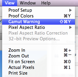
If we apply the gamut warning all colours that a going to be changed during the conversion from RGB to CMYK show up in grey.

Hue and saturation is a good way to edit this and make the picture more printable.


Another way is to select a particular colour (blue for example) and then select replace colour. Then adjust the fuzziness and saturation to edit them slightly. If this is done with the gamut warning still on, you will see the conversion from design for screen to design for print.


If you select proof colours, without the gamut warning on we are still working in RGB (small file size and all filters available) but shows a proof of what it will look like in CMYK. But we must remember to convert it to CMYK before printing.

Hold the alt key and click on a swatch to delete it.

To create a new colour click the foreground colour. 
If the exclamation symbol shows, this means that the colour you have selected sits outside the printable range of colours when using CMYK. If you click on this symbol then it will automatically change to the nearest printable colour.

When you have chosen the colour you would like to use, click add to swatches to save.
If you click on the colour libraries on the colour picker menu (you get to this by clicking on the foreground colour) it brings up a Pantone menu of spot colours. If you select a Pantone and just type, you can use the reference number system to look up a particular colour.

The problem is, is if you just save the spot colour as a swatch with no reference number and use it within our image, then it will just be printed with CMYK and not with the separate printing plate. This makes the spot colour pointless.

Working on a grayscale image.


Set to a duo tone image. Duotone- two colours. Monotone- one colour.

Click on the colour to change it and click on colour library to access the spot colours.


Click on the box with the line through it to edit how the black is replaced with your spot colour, rather than just completely replacing it.

If you place this image into a different file, or in InDesign then the spot colour swatch, with reference number is also exported.
Go back to the menu by clicking on duotone on the drop down menu once more. Select duotone to choose a second colour. This makes this image duotone.

You can edit the ratio of yellow to green by once again clicking on the box with the line through it, and going back to the duotone curve menu box.


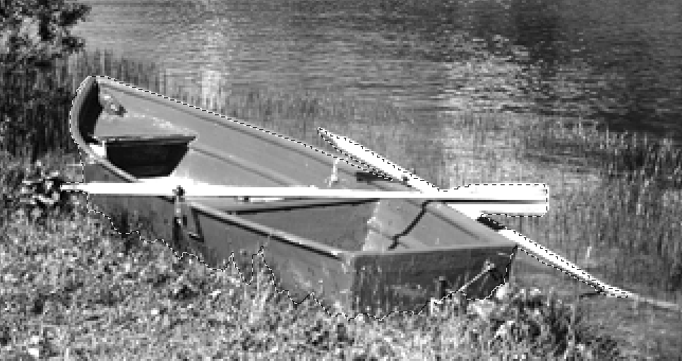
Another way to use spot colours is to add it to a particular section of the image. Start off by selecting a certain part of the image.
Click on the channels option and then go onto new spot channel.

You can then choose a spot colour through the Pantone library, which edits the selected area. There is a transparency to the ink, it does not hide the black pixels. It 'overprints' the image.

You can also edit where the spot colour is applied by viewing the spot channel and using various different tools to create different effects.


Save the image as either a photoshop or tiff file and make sure the spot colour is checked so that it saves as well. Jpegs do not save spot colours.

No comments:
Post a Comment