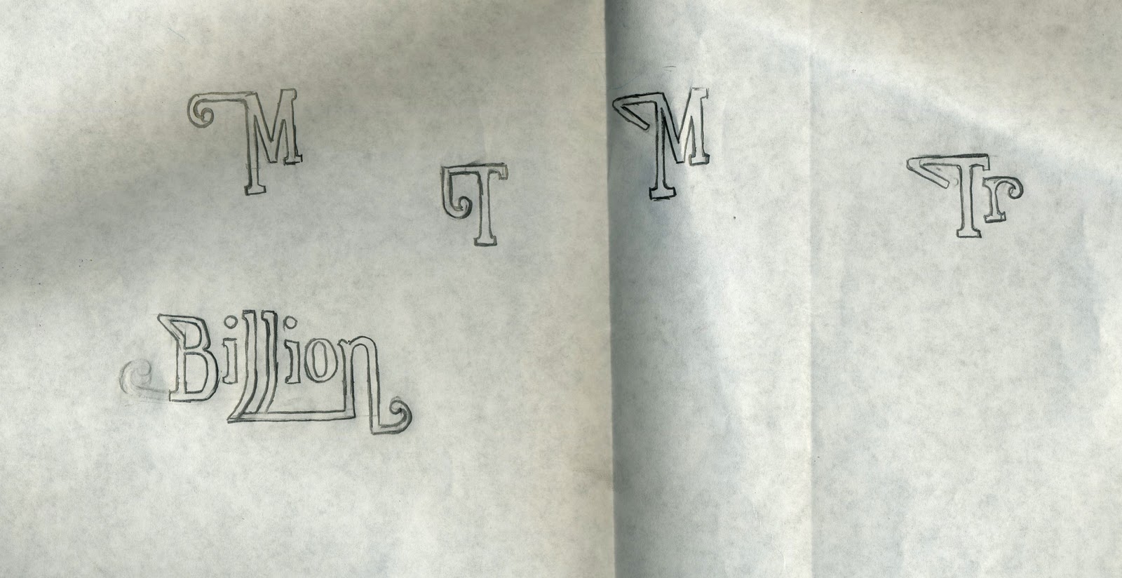
I designed three coins to communicate the million, billion and a billion phrase. I kept the shapes simple with minimal detail, as I think the colours and shapes speak for themselves. I created the type from Euphorigenic.


I decided to screen print this design because I thought it would work effectively with the metallic colours and simple shapes. I made use of a lot of negative space on the A1 format, keeping the coins almost scaled down to actual size. I decided to do this to help communicate that they are coins. Also it reflects the content of the article, which is about people not understand the magnitude of numbers. By keeping the text small it communicates how people underestimate how big these numbers are. The fact that million is on a 2p, billion on a 50p and trillion is on a 2 pound also reflects this point in the article.


Visually working with the words million, billion and trillion worked really nicely as the last letters are all the same. I printed it on white stock initially, but I also really like it on the black. I also prefer the design without the words in between, so it only says.. million billion trillion.
No comments:
Post a Comment