 ... I need to be careful
 what some people may
read into the ambigram


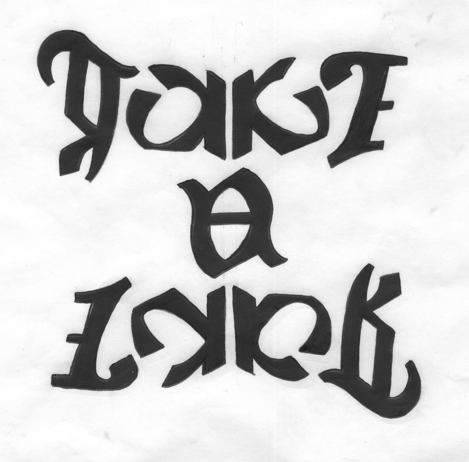
My kind of type...


Take a look...


Reverse...


After having experimented with different styles, effects and layouts with my three anagrams I have decided they are going to look much better kept simple. I want the main focus to be on the words, seeing as they are difficult to read as it is, adding to much to the overall poster design will make them even harder to decipher. I think the words sit better on the page landscape and think they will work better as a set if the layout is consistent throughout the three posters. Also adding too many effects I have found make them look really tacky and kitsch.
No comments:
Post a Comment