Showing posts with label OUGD202. Show all posts

Wednesday, 8 February 2012

Evaluation


BA (Hons.) GRAPHIC DESIGN
LEVEL
05
 Module Code 
OUGD202                      


 Module Title
DESIGN PRODUCTION - DIGITAL


END OF MODULE SELF-EVALUATION

NAME
Sadie Thompson


1.  What skills have you developed through this module and how effectively do you think you have applied them?


I have developed my skills on After Effects. Previous to this module I had only worked very briefly with Flash, even then I didn’t feel like I had learnt a substantial amount about the software. I now feel comfortable enough to get on with using After Effects on my own, and can either work out what I want to do or work from relevant tutorials. The thought of starting a new After Effects project is no longer daunting to me and I am much more comfortable using this programme.
I have also improved on my ability to storyboard and realised the benefit of doing so. It has definitely made animating my sequence a lot easier in the end and also allowed me to realise some faults before I started to animate.


2. What approaches to/methods of design production have you developed and how have they informed your design development process?


Storyboarding has helped me to get my ideas down quickly, without having to work out how to animate them. This would waste time and would make it more likely for me to forget some of the details of my ideas. Storyboarding has been beneficial to me developing my ideas in detail and for predetermining what could possibly go wrong. They have also helped me to consider time, giving me a solid frame to start with. Title and actions safe zones are also something that storyboarding has helped with.
I also found that the format of the workspace was a tricky one to work with, as most of my artwork would probably work better in a square format. However I had to consider that it could be viewed on either a widescreen or classic framed T.V.


3. What strengths can you identify in your work and how have/will you capitalise on these?


The strongest feedback I have received time and time again in my crits is that both my idents and my title sequence reflect the theme of my chosen channel, E4 and stays true to its style. I have used my ability to work in Illustrator relatively quickly to my advantage, and vectored all of my artwork to be used in my final sequences. I feel that vectoring these images has kept the style consistent added to the general feel of my animations.


4. What weaknesses can you identify in your work and how will you address these in the future?


I feel like I could have come up with more initial ideas. I seem to have come up with one general idea and developed and changed it as I progressed and worked on more storyboards. I feel that I could have worked on sound more. I am happy with the music track that I have used for my title sequence, and all feedback that I have got in crits have said that it works well. However I have just used the ending of the song in the ident, which also works well and ties them to the title sequence, but I feel I should have added some sound effects. I did try this initially but they sounded tacky, so I should have either recorded the sounds myself or searched further for some better quality sound effects.


5. Identify five things that you will do differently next time and what do you expect to gain from doing these?


1.    Do more contextual research to influence my style.
2.    Look at more tutorials online, and ask for more help to find the most efficient ways to animate on After Effects, rather than trying to work out on my own.
3.    Do more initial ideas.
4.    Consider recording my own sound effects rather than just looking online.
5.    Manage my time more effectively so that I can get both my final designs and blogging to a good standard by hand in.


Tuesday, 7 February 2012

Top 10

My final title sequence with sound.


My final idents with sound.


Monday, 6 February 2012

Top 10

I have added sound to my idents. They are sound effects relating to each on along with a section of the song i have used in my title sequence. Even though initially the idea of using sound effects seemed like a good idea, in reality it doesn't seem to work and just sounds tacky and unprofessional.


Instead I have decided to just use the section of the song which works well on its own and ties the idents in well with the title sequence.

Saturday, 4 February 2012

Top 10

I have tweaked and tried to perfect my idents. I have sorted out the timing, and also moved the E4 logo about a bit to sort out the composition. I made sure that the logo bounces in at the same time on each ident as well to keep them consistent.

I also managed to finish my final ident relatively quickly.


Friday, 3 February 2012

Top 10

I have added the next step from my storyboards. I still feel like the pace isn't quite right and things are panning away far too quickly. I am going to get all of the basic animation done and then work on the pace afterwards.

Top 10

Today I managed to add the next scene on my title sequence, the girl throwing up into the toilet (nice).

I think I over thought the way I was going to do this and it just looks messy, I should have probably kept the hair and face on the same layer. It doesn't look smooth enough and it is really obvious that they are all on separate layers.
After rendering this out, I also realised that the camera pans over far too quickly. I tried to adjust this, but because there are too many different layers making up the artwork it went all over the place. I decided that its best to just start over.


This time I kept it simple, dividing the scene into just four layers and keeping the motion to a minimum. This looks much better, and far smoother.


Thursday, 2 February 2012

Top 10

I have been working mainly on my title sequence, as I think I should prioritise getting this done before the deadline, and my final ident shouldn't take too long after this.

I have managed to get the next 6 seconds done, I have been working alongside the beat of the music. I have tried to keep the motion of the piece quite fast paced and dynamic to suit the song.

I have added the scene with the girls dancing, with the disco lights on them. It looked strange just having this, so I decided to add a disco ball.


After rendering this file out, I realised that the lights were only shining on one of the women so I had to change around the order of the layers. 


Again in this scene, I have used the null layer to zoom in and out and change the camera angle.

Tuesday, 31 January 2012

Top 10

Today I worked on another ident and got the first 10 seconds of my title sequence done.


I have been using the song that I have previously chosen, and judging by the first ten seconds I think it works well. It also suits the pace of the animation. 
I have made good use of the markers on the sound layer, so that I can move the camera about in time with beat of the song.


I have added some keyframes so that the audio fades in in time with the drinking women sliding over. I intend to leave the song to end without a fade, as it comes to quite an abrupt end which suits the sequence, it could also be a good way to tie the sequence to  the idents, if I use the same abrupt ending.


My first ten seconds was relatively easy. I found it quite challenging however to create an effect where it zooms in, without distorting the images. Initially I tried to just alter the scale of the layers themselves, but the positions would change and it didn't have the same effect. So instead I added a null and camera layer, which I think is going to be very useful as I move the camera around quite a lot in my title sequence.

I also partnered the layers together as I only need to rotate the hands at the end and altar the positions slightly, this was so that they move around together and don't look separate.


Monday, 30 January 2012

Top 10

Today I started animating my idents. I started with the simplest of my four ideas to ease myself into it. Both went really smoothly and I didn't really find it too difficult. All I need to do is add sound, I am going to record sounds of a cocktail being made and ice being shaken about for the 'hair of the dog' ident and sizzling bacon for the fry up one.

Initially I felt this ident looked too dark. I was using a light layer to try and add texture, so I took that off and it ended up looking a lot better. I added a concrete texture in the background and lowered the opacity. I like this look better than having just a plain white background, which just looked lazy and unthought about design.


Tuesday, 24 January 2012

Top 10

I have been working on more illustrations for my title sequence. Working from my storyboards, i know what needs to be done, and so far I think I have everything down. I have also vectored the images for my final ident, which is a pill being dropped into water.


I will add the fry up to the hungover girl inside after effects as it is easier to scale it up and down. Also I will change the scale of other elements such as the pill in comparison to the size of the glass for the same reason. 
I have kept each element that needs to be moved separately on individual layers each labelled clearly, to keep it as easy for myself when working inside after effects.


Wednesday, 18 January 2012

Top 10

I have carried on illustrating the images that I intend to use in my title sequence and idents. I have kept the style very simple to reflect the light hearted feel of both the content of the programme and of the channel E4. Keeping the imagery simple also gives me the chance to focus on the animation side of things.

Again, I have kept the sections I want to animate on separate layers and labeled them to save confusion later on.


I have also vectored the E4 logo and banners that they use when advertising upcoming programmes to make the idents look professional and in context.


Silent movie

My final silent movie animations.


Top 10

I started vectoring up some drawings on Illustrator for my title sequence. This turned out a lot harder than I originally expected as I had to think ahead which bits I want to animate so I can keep them unattached to each other to allow movement.

I have also rendered the images as they consisted a lot of vectors, so I am worried that After Effects might freeze while I'm working on the animation.


Top 10 Progress crit

Strengths:

Storyboards easy to follow, full sense of story
Good key framing
Simple, easy to create imagery
Text isn't very necessary
Good amount of research

Areas for improvement:

Is their colour?
Pace of pan/ movement
Will the idents last 10 seconds?

Considerations:

Maybe have the first frame in the middle? Taxi there or something before, will it last 60 seconds?
In the last frame try emptying the plate of food and have "top ten" in ketchup or crumbs
Colour
Type
Liquid flow could be complicated

Additional comments

Pain killer ident works well

Tuesday, 17 January 2012

Silent movie

gif creator at gickr.com

Slent movie

make a gif at gickr.com

Silent movie

gif maker

After Effects Induction 4

Make sure you choose the square pixel widescreen option as opposed to the widescreen option when working with Illustrator or Photoshop files. Otherwise files that you copy over may appear distorted.


Creating text within After Effects.


You can select the text by dragging over or by double clicking on that layer.


It is all on one layer, so we can'y animate each individual layer like we can with outlined text copied over from Illustrator.

The animation options are all the same as usual.


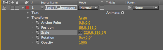
The first difference is the position of the anchor point, normally it would be in the centre of the image, but when working with type within After Effects it is positioned at the beginning of the text.

If you want to changethe anchor point, simply drag over the yellow numbers next to the anchor point option.


However, the downfall with this is that it moves the text and not the anchor point, changing your animation.
Another, easier way to change the anchor point is by selecting the pan behind tool.


The properties specific to text.


The source text property allows us to change what the text says or the format of the text over time.

If you remove some words, a square keyframe appears.


Using this property you can make more text appear over time.


You can also change the colour of the text over time.


...and the size.


We have a little side menu called animate.


Choosing position to start with.
We have added an animator option to our text properties.


We now have two position properties, they both do different things.


We need to look at the range selector, start, end and offset.


If you change the position by using the yellow numbers and then change the start, it will move it back to its original position, letter by letter.


The percentage determines how much of the text is effected.


Another option is to animate using the offset selection.


If you change the start and end so that part of the text dips, and then further down the timeline you change the offset, then the dip will move through the text.

If you drop down the advanced menu and change the units from percentage to index, then it allows you to animate the text character by character.


You can also change the mode.


You can delete each animation by selecting the animator layer.


Now work with the scale.


If you select index then it allows you select how many characters are going to be effected. Change the start and end to 10 and 11 and then change the offset.


Changing the tracking amount will change the spaces between the characters as it changes size.


You can also make it change colour.


Changing the offset, smoothness and other settings will change the effect.

To make the text move along a path, create a new mask and then with the pen tool draw a path. On the path option menu select your mask and then the text will sit on it. Then change the number next to first margin to make it move, adding keyframes.


VIDEOO!!!