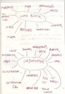
We found that pressure was a recurring key word and is essential to each of the processes. So we came up with the concept of the three P's, Print, Process and Pressure. We figured that we could come up with a nice simple design to do with this idea and started off with designing a logo to brand our packaging with.
Here are some initial sketches done by Charlotte...
Working from this I managed to develop a logo and design for the postcards. I have used the font Bauhaus to arrange three P's in different ways to create a pattern. I chose Bauhaus simply because of its aesthetic quality when arranged in this way. I experimented with serif fonts like Times, but it didn't look quite right. I also did a couple of designs using Herculanum and Kino, but and Char both feel that Bauhaus is the strongest design.
Herculanum...
Kino...Times...
As you can see I tried looking at the designs to see how they are with reversed colours, I think that this could work well with foil blocking. I also singled out the logo within the pattern and changed the colour to draw attention to it. I really like the look of this and think we should do it when screenprinting.
We also designed our final logo for the packaging.
This one being our favourite...


No comments:
Post a Comment