Thursday, 17 March 2011

InDesign Induction, part 2

This week we were given a task. Using what we had been taught in InDesign we had to recreate an existing magazine spread, although its pretty uncreative I feel a lot more comfortable with using InDesign after this session.


Monday, 14 March 2011

Ambigram street art

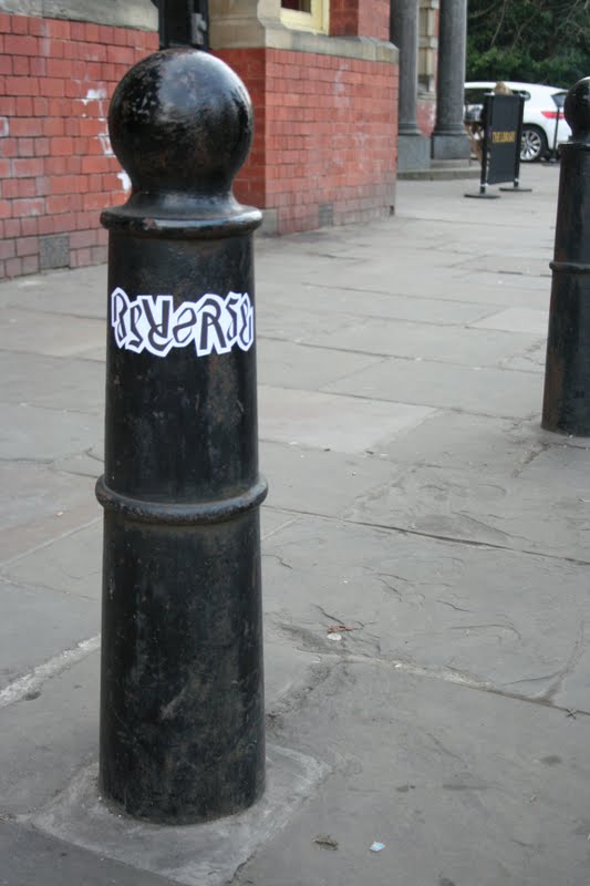
I wasn't entirely happy with my ambigrams just as vectored images, so I decided to take it a step further and get some stickers printed. I then put them up around the streets of Leeds. They look pretty good and have made some good photograph. By doing this I am also getting my designs out there to be viewed by the general public.


Change of direction...

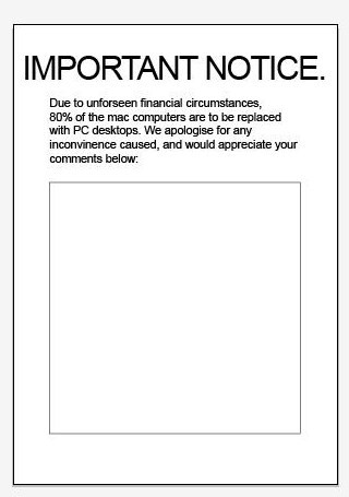
After having the weekend to revaluate our brief we have come back feeling much better. Individually over the weekend we have been trying to get some lies out into the public to see what reactions they would cause, we communicated with each other and shared our designs over Facebook. The most successful one was a poster posted round college saying that 80% of the Macs are going to be replaced with PC desktops, causing people to leave annoyed comments and also one person on our own course asking whether it was true.


We thought that it would be best to keep the designs simple, as we didn't want to make it obvious that it was designed by someone who clearly studies graphic design, otherwise we might get found out!
Here are few examples of the designs we have done...


Saturday, 12 March 2011

InDesign Induction, and type and grid continued

To begin with in my InDesign induction I just experimented with some images of my partner (Marty) and random type to get to grips with the software before I attempt to tackle it with an actual page layout I intend to create.


After a session of experimenting, I decided to look back at my magazine layout that I redesigned in visual language. I am happy with the finished design, and if anything feel more confident with using InDesign. I am looking forward to learning more next session.


The original magazine layout...
My initial design...
Final design on InDesign...

Friday, 11 March 2011

Crit feedback...

As our crit wasn't scheduled until the afternoon, we decided to make good use of the morning by sketching and mocking up the general layout of our childrens book. 
Feeling that we were making progress we could only hope that our crit would go well. Unfortunately many problems were brought to light with our general concept, the main problem being our target audience (children aged 5- 9). This was a problem as not all children can read at the age of 5 and wont necessarily understand the light hearted tone of  the book, also most 9 year olds may find this book too childish for them. 
Overall I think we just got a bit ahead of ourselves, we went with one of our first ideas without exploring many others. Also it seemed we were in a rush to come straight from problem to product all too swiftly, which is easy to do with a slightly longer brief after still being in the 'one week brief panic' frame of mind from the week before.

As of yet we are still a bit unsure of what direction to take this brief, but we intend to begin by posting up lies in public areas and the college. We have decided as a group that it is best to see what designs we can come with over the weekend individually and back on Monday with fresh minds.

In Design. Workshop briefing.

The first idea I've decided to research into is the nature article, which is initially my favourite.


Book fair brief... 'Squares'