Friday, 30 September 2011

Typography

For our first typography session we pretty much covered the basics- what typography is, software used, keyboard shortcuts, paper sizes, point size etc.

Some good tips that Graham gave us were these:
-Research the Gutenberg bible (1450).
-Learn keyboard shortcuts.
-Know your paper sizes.
-There are 72 points in an inch.
-The less you put on a page the better.


We were set a series of tasks to show us what can be communicated just by changing small factors in typography. First we were told to write our name in a font that we think communicates our personality.

We were then asked to type the word 'dog' in a way that communicates each of the following.

Intelligent dog.

Scared dog.

Big dog.

Friendly dog.

This was a great eye opener and I got a lot of great tips and advice. The main elements i experimented with changing this session were.. point size, font, weight, serif/ sans serif, italic/ non italic and the placement on the page.

Wednesday, 28 September 2011

Good is...

My rational for today...


Today we did an exercise with Fred that totally opened up my idea and gave it so many more possibilities. I now have a lot more research to do but I feel like I have more direction.


From these categories we were told to take the most fitting word or statement for each one, I am not entirely happy with mine as I felt a bit rushed and I would like to give them some deeper thought before I finalise the list for tomorrow.

Here is my list so far...

What makes it good? 
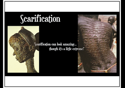
Every process has a story and meaning behind it.
Who would find it good?
African tribes people.
Who wouldn't find it good?
Certain religious groups.
What is it better than?
Body modification in the western world that has no meaning behind it.
If it was a profession what would it be?
Tattoo artist/ Piercer.
If it was a celebrity who would it be?
Naomi Campbell.
If it was a place where would it be?
Africa.
If it was an event what would it be?
Notting Hill carnival.
If it was a product what would it be?
Jewellery.

Tuesday, 27 September 2011


Good is...


Design for print: Illustrator

If you want to export Photoshop files into Illustrator then you must remember to go to preferences then plug ins and scratch disks and set to scratch.

The cross hair swatch (registration) is essential for the commercial print process. Not good to use in actual artwork, because could cause a bleed when printing, to be used for printer marks.

New swatches, go on the swatch drop down menu and add used colours. Adds all colours on the artboard as individual swatches.


Global swatch- If you edit that swatch it changes all of that colour on the artboard.
Non global swatch- Individual.

If you edit tints and save, if you edit the original global colour it also edits the tints.


Spot colour- Ready mixed inks that cannot be created by CMYK, requires its own plate in printing.
It is possible to print colours that aren't CMYK if a separate plate is made, which is sometimes cheaper if a lot of the same thing is being printed, for example brands will want exactly the same colour across a range of prints. Also used for some colours that can't be produced with CMYK, like metallic of fluorescent colours.

Pantone is used a lot for branding and spot colours for consistency so that the colour is exact every time.

Making Pantone swatches
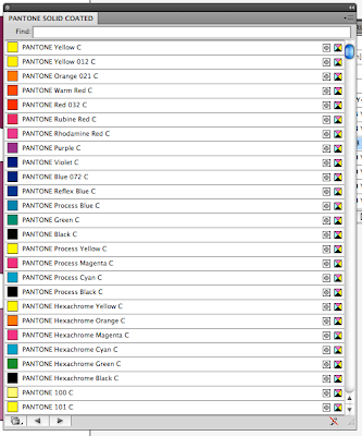
-Open swatch library color books
-Pantone colours


Solid- ready mixed ink 
coated/ uncoated- type of stock

Search for Pantones by their reference number- show find field in drop down menu.
You can add a Pantone to your swatch library just by clicking on it.


Pantone process guide is a swatch book that shows the CMYK equivalent to a Pantone colour. 

Print options- Output 
Change from composite to separations.

Image - you can alternate between the positive and negative of your image. This is good for screen printing.

Save a swatch library

Save as AI- this makes it available from any other Illustrator file.
Save in the swatches folder in the home folder- don't change the location.