Tuesday, 15 February 2011
Thursday, 10 February 2011
Sunday, 6 February 2011
Collection 100...
During my crit I was told that I had a solid idea, but my design needs some rethinking. The colour scheme is too consistent throughout the 100 designs, making them a bit boring. Also I was told that I need to work on the type, concentrating on the layout and watching out for widowing.
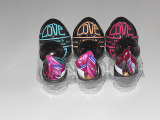
Firstly I changed the font from Myriad Pro to Birch Std, which I feel pulls the design together a lot more nicely. Also I decided to change the colour scheme using the classic traffic light coding, to indicate whether the sex position is easy, medium or hard, rate by technique and effort. I chose to do this, because not only does it make the designs more interesting with some variation, but it gives the difference in colours some relevance as well. I have designed three variations of the packaging as well so that the consumer can tell the difficulty before purchasing the product.
Friday, 4 February 2011
Paper Folding
In todays visual language session we were told to go and buy a magazine from the library and then given an adjective to work with. We then had to manipulate the form of our book or magazine to represent our word by cutting and folding. I was given the word drowsy.
Tuesday, 1 February 2011
Subscribe to:
Comments (Atom)


